I’ve been working on an alternative web UI for Lemmy for a couple weeks now and it’s got enough features I wanted to share it. I love that somehow people have found it despite me never having posted online about it until now (until a couple days ago it was called sx-lemmy, sx being an abbreviation of my username) so you might have seen it in a list already.
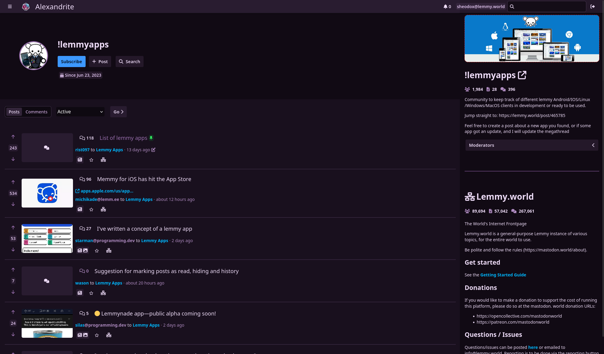
Alexandrite is a (for the moment) desktop-first Lemmy interface, I primarily use Lemmy on my computer and I wanted a more convenient way to view posts and comments without juggling tabs or losing my place in the feed (with infinite scrolling). It’s still very much in beta, and I have a lot of work to do still, but it’s got most of the basic features.
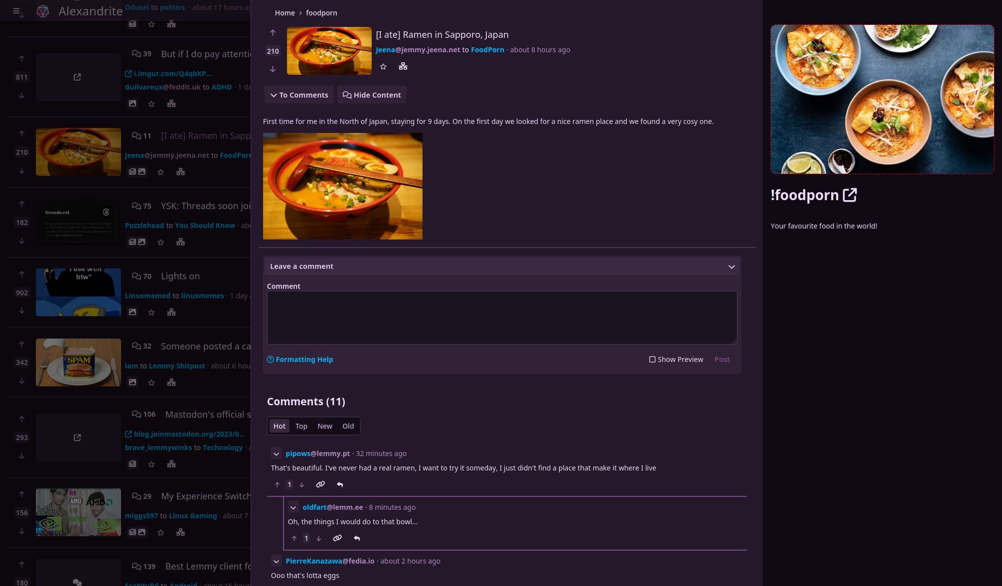
You can view a post and comments in an overlay without losing where you scrolled to:


A non-exhaustive list of things you can do:
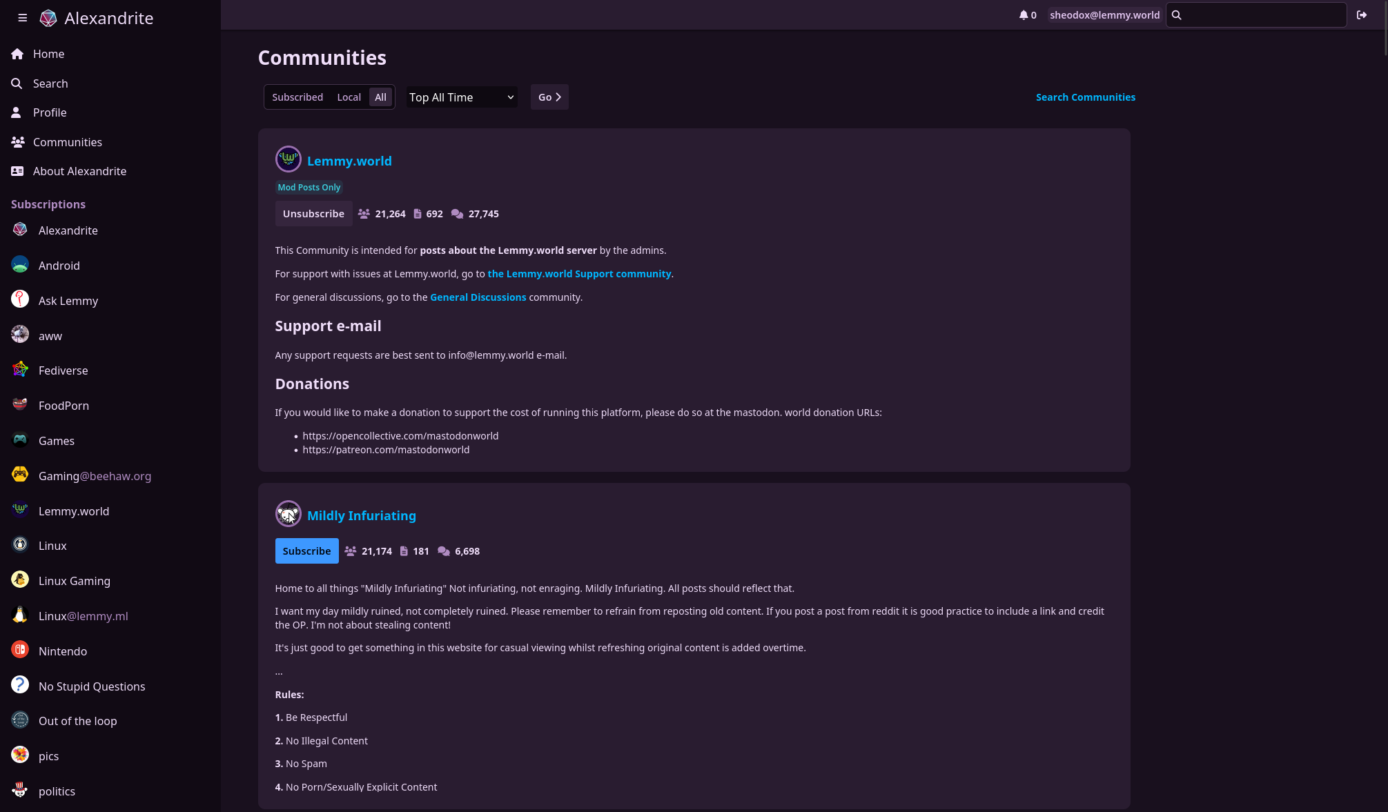
- view home/community/user/communities feeds
- post/comment
- subscribe to communities
- vote
- save posts
- search
- inbox stuff
Noteworthy missing features:
- reporting
- blocking users/communities
- mod tools
- image uploading
- automatic linkifying of urls/communities/users in comments/posts
For those who care, it’s all Sveltekit which is a dream to work with. Alexandrite is the name of the kind of gem in my wife’s wedding ring, it looks cool and changes color in the light.


Thank you for developing this! Ask someone who uses Lemmy on their tablet this could be a great fit.
It would be awesome if the list of posts could be fixed on the left side and then the right part of the screen for the content of the selected post. The overlay is a good step in the right direction, but the link is quite small to tap correctly.
Below is a screenshot of my Reddit client, because a picture says more than a thousand words:
Thanks again!
I’ve been working on this tonight, and I’m most of the way done. Just need to do a bit more polish and hopefully it can get deployed to the main site tomorrow.
In the meantime, if you want to test it out and give me some feedback I’d appreciate it! The preview of the new version is temporarily hosted at https://column-feed-view.alexandrite.pages.dev/
Once you log in, go to the settings by clicking the User icon in the top right, you can change your feed layout in there.
Oh this would be a great idea. I’ll add it to my todo list, it’ll probably be an alternate feed layout setting someday.