This all seems very reasonable, it seems like the plasma team made the right decision to remove semi-broken / obsolete parts, but Unsplash removal because of AI scraping is a bit disappointing.
There is a wallpaper plugin that grabs pictures from subreddits of your choice, or probably was if they used Reddit’s API. Maybe one could port this to Lemmy or other services.
Plasma is amazing. It has been my DE of choice for years now. So happy I’m donating to the project.
May you sleep well tonight and have a wonderful poop in the morning.
Can’t say that I’ve really used any of the features mentioned in this list, so doesn’t really affect my experience negatively. Also, updating some icon sets to fit with the overall theme would provide a more unified experience. So two thumbs-up from me for removing code that, by & large, wasn’t getting used, should help maintaining it in the long run.
At first I wanted to “complain” about the removal of the thumbnails task switcher, because I prefer that one. But then I noticed that the thumbnail grid is the same and better! So if you were using what I, maybe the grid version is what you actually want.
Also, I love the concept that you can put back things that were removed from Plasma without building it all yourself.
Thanks, I had no idea the “thumbnail grid” existed. I usually hate changing things I use all the time but this one is most definitely an improvement.
Shame about khotkeys, but I get it.
Thank you for the reasonable communication, it helps.
It’s being replaced by another tec that does use Wayland. All functionalities will still be there
I’m skeptical that ALL the functionality will be recreated. We’ll see.
Losing Unsplash hurts :(
Yah, pretty unhappy about that but if that’s what Unsplash thinks they need to do, not much Plasma devs can do about it.
What’s this, first time hearing about it
Unsplash hosts stock photography. The feature would grab an image every day so that the wallpaper would be different.
Icons in Plasma Styles
In Plasma 5, the icons shown in various parts of Plasma widgets (but not apps) can come from one of two places: the active icon theme, or the active Plasma style. How do you the user know which icons come from which place? You can’t, not easily. What can you do if you apply a Plasma style and it includes weird icons that make your Plasma widgets look visually inconsistent with the rest of your system–but only partially? Nothing!
[…]
For Plasma 6, we’re removing this questionable feature, and icons in Plasma widgets will always come from the systemwide icon theme. Much simpler, much more user-comprehensible, much better visual results 99% of the time.
I’ve tried to give Plasma a fair shot a few times, but, among other issues, I’m not a fan of Breeze and I found the theming functionality overwhelming and difficult to navigate. Mainly I could never figure out which themes certain elements were attached to. This is a big example and I’m glad to see them changing it.
I miss:
- old amarok
- actively developed oxygen qt style
- wallpaper per virtual desktop
- window tabs
- latte dock
- parachute
I will also miss:
- khotkeys
- plasma theme icons
- windowed widgets
- icon size settings
- some task switchers, I think
Amarok and Oxygen. Yes. 😔
For Amarok, have you tried Strawberry? It’s based on Amarok and looks pretty similar but it’s actually maintained.
I have used Clementine and Strawberry, great projects, but unfortunately I no longer have my old music collection, and rely on streaming services these days.
I miss latte dock too, I wish someone would fork it and get it going again. I would do it myself but I’m too lazy and stupid, I just want to use it for free.
Have you tried Trinity Desktop? It’s a continuation of KDE 3.5 and it has many of the things you miss and will miss.
I haven’t, at least not in years if I ever did. I didn’t start enjoying Plasma until 4, and I have a feeling I’d miss a whole different set of features going “back” to a 3-style desktop. Do you actually use it daily?
I do use it daily, yeah. :)
There are a bunch of paper cuts simply because their team is so small that maintaining technical integrity itself and refactoring (e. g. the move to python3 that was completed recently) is a monumental task in and of itself, with new features or bugfixes being a distant priority at best. That’s why there’s still some inconsistency whether some niche features really work or whether things are adapted to work with TDE instead of a stock KDE 3.5; up until I made a pull request to fix it a couple of weeks ago, Konversation still by default pointed to Freenode instead of Libera.Chat for example.
I mean it makes sense, maintaining a desktop environment with dozens upon dozens of programs and features like KDE is really something that needs about as big a team as the KDE team itself was back then, and the handful of people who maintain TDE now are definitely not enough. There’s still apps without a dedicated maintainer, for example, who only have generalists looking if it compiles for every update. It’s not ideal.
That all considered, it runs very well out of the box!
As for positives, it’s my desktop of choice because I disagree with the design philosophy of modern DEs. It seems like they all tend to converge into the exact same direction. It’s all either a macOS knockoff or a Windows knockoff. I can’t even tell Plasma 5 from Windows by default! It has a taskbar on the bottom with a start button to the far left, the clock and date in the bottom right along with the tray and notification area. Desktop icons, right-click context menus, the same general UX. It looks, feels and works exactly like Windows 8-11!
The flat and blur-heavy corporate design that was originally created to be as cheap and agreeable with as many people as possible to maximize profits is entirely uncritically copied by almost all desktops now. Every IRC/XMPP/Matrix client now needs to look like Discord or WhatsApp! I miss when there was still playfulness and personality in design; something like early video game UIs with crazy fonts, materials, textures, colors. UI widgets that felt physically hefty to use, like a button that actually looked like it depressed into something, or tactile, sharp scroll bars. Window decoration that was themed after fantasy creatures, or if you want it more professional, something like wood or marble. You know, something human!
Even the app packages themselves show barely any divergence: every DE nowadays ships with Firefox or Chromium, for example; while in the past, almost every project had their own browser with different features and design goals. Remember Konqueror? I use it on the daily now and didn’t know how cool a file manager-browser hybrid was until I tried. I realize that this is a technical issue and not a motivation issue, but hello?
Innovative features and really experimental design choices are also a thing of the past apparently: ROX Desktop with its drag-and-drop mantra, WMaker with its dockapps, the various 3D environments that cropped up over the years… hold left-click on an empty desktop for an application menu… iconified windows… it’s all gone. It’s all Windows or macOS clones now.
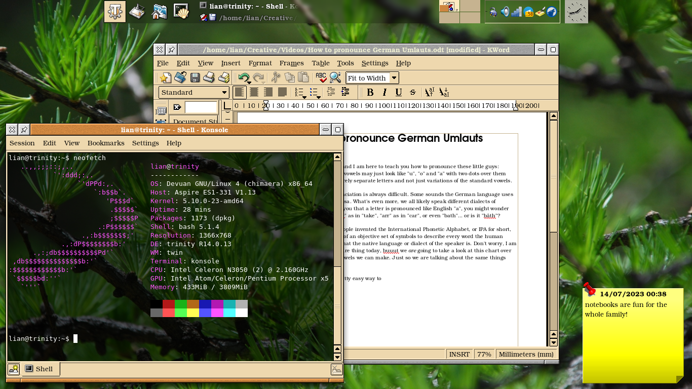
Thanks for the report! I’d love to see a screenshot of your set up if you don’t mind and get chance.
Sure, here you go!:
Can anyone explain Windowed Widgets to me? I don’t know if I used it or not.
Basically, you can open some widgets inside a standalone window instead of attaching them to a bar/desktop, making them act like some kind of standalone application instead - including losing all their state as soon as their window is closed.
Actually very cool! Unfortunate that some people used them wrongly.
The only widget I’ve found in any way useful as a detached window like that has been the sticky note, and even there the usability is limited compared to just opening kwrite - or any other simple text editor.
It’s definitely an interesting - if quite useless and potentially confusing - feature, but it makes complete sense to drop it from core and instead let it live as an extension instead, since it’s quite literally just a krunner runner anyway.
For the desktop wallpapers, it couldn’t use the unsplash api? Just ask the customer to input an unsplash api key
… “So for Plasma 6, we have removed them, to steer people towards better options.” Things that I don’t want to hear from a software projects that supposedly respects my intelligence. I don’t want to be “steered”.


