
Still there on my mine on my Pixel 8. Well, most of the time. Sometimes it doesn’t have any accompanying image.


Still there on my mine on my Pixel 8. Well, most of the time. Sometimes it doesn’t have any accompanying image.


Ah, they finally killed the frog. Maybe the one last bit of fun left in a google product. RIP


any better source than a random discord screenshot?
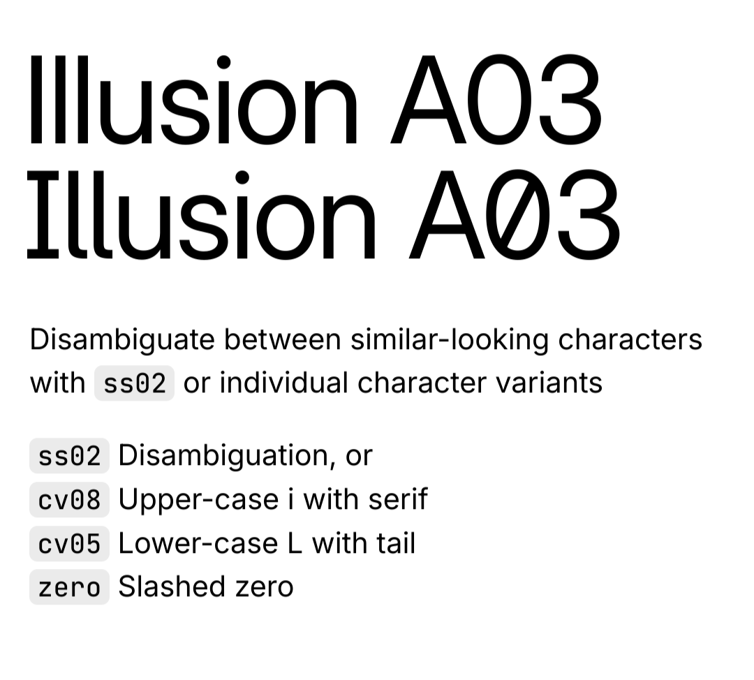
The Inter typeface is very versatile and has many different options and variants, including more distinguishable uppercase i and lowercase L. The article just installed the base version as an example. https://rsms.me/inter/ 
The geometry and perspective don’t make any sense either.


It’s not an either-or situation. Companies should still be criticized and stopped from exploiting children.
GNOME. A lot of people customize it to look and behave more like Windows or Macos, and I used to as well, but after giving the default configuration a chance and getting used to it, I prefer it over everything else. It’s way more focused and organized, and I can navigate through my open windows quicker and easier. It’s just a different workflow you need to adjust your brain to.
I thought it was funny